Bringing a Fourth-Generation Seafood Supplier's Story to the Web.
Visit the Live Site ↗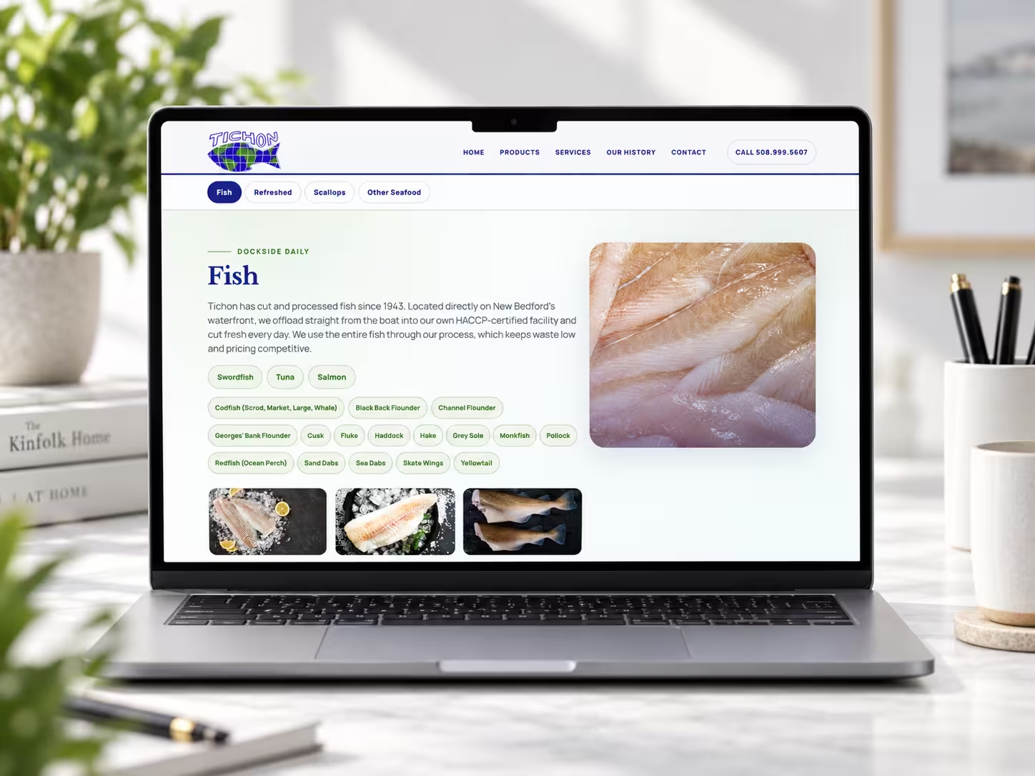
One Data File Powers Every Product & Service Page
Tichon sells four distinct product programs and four services, and every one of them lives as a single entry in a shared data file. The header dropdown, the mobile accordion, the anchored Products and Services sections, and even the sitemap all generate from those same entries - add a new product line and it appears everywhere it needs to, with no hunting through page templates to keep things in sync.
A Four-Generation Story, Told With Real Archives
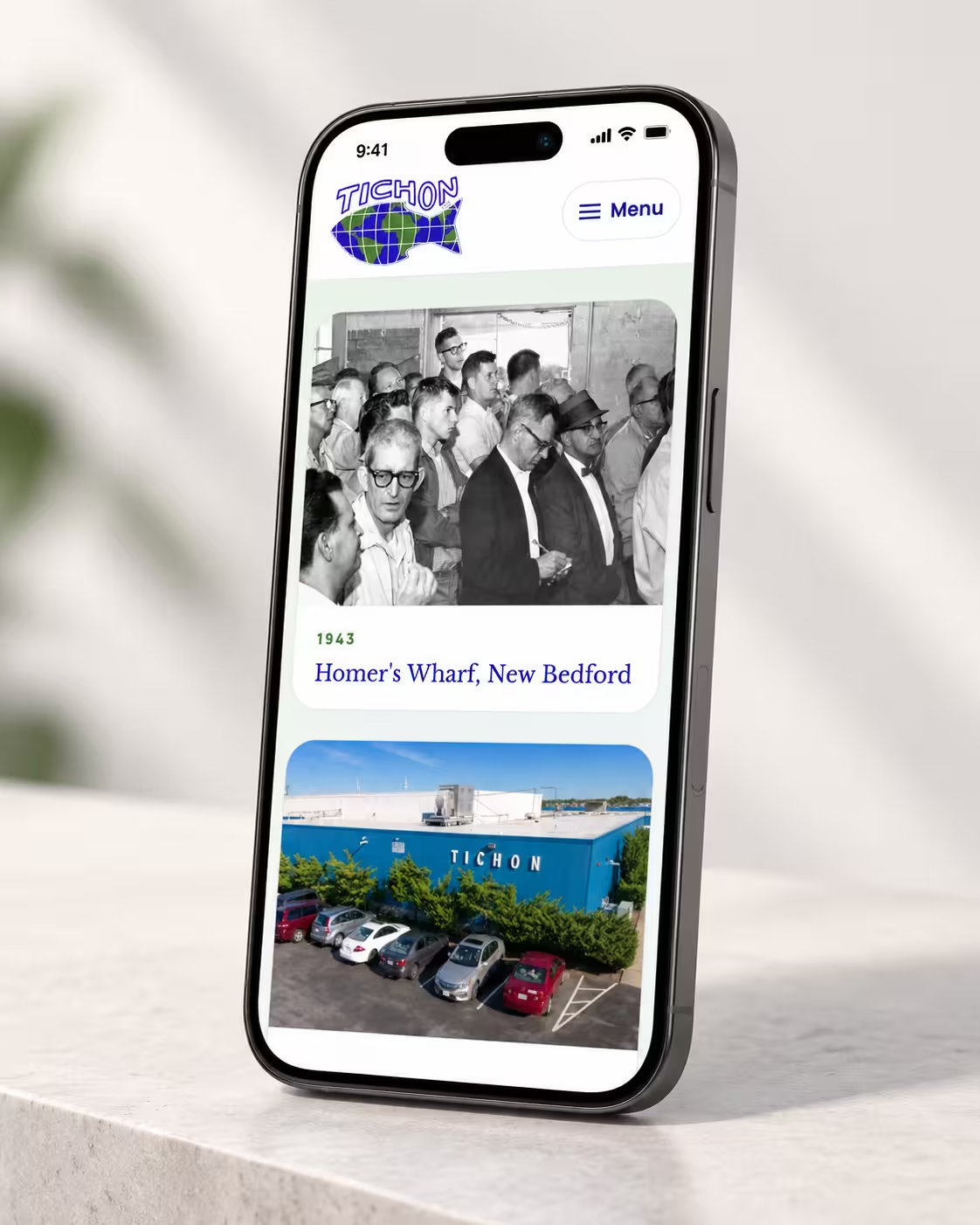
The site carries a full company history timeline - from a 1930s neighborhood market through the founding of the seafood corporation to the fourth generation running it today - illustrated with real archival newspaper ads alongside current facility and vessel photography, backed by a parallel image registry that flags whether each photo is verified Tichon material or a placeholder awaiting the real thing.
The Overview
Tichon Seafood Corporation is a fourth-generation, family-owned wholesale seafood supplier and processor on the working waterfront of New Bedford, Massachusetts - one of the highest-valued fishing ports in the country, largely on the strength of its North Atlantic sea scallop fishery. Capital House Media rebuilt their web presence on Astro 5, deployed on Vercel, replacing a dated static site with a fast, data-driven build engineered for a non-developer client to extend on their own.
The Challenge
The old site didn't reflect the scale or credibility of a company operating continuously since the 1940s. It needed to present four product programs and four services without becoming a maze of thin subpages, carry real institutional trust signals - HACCP and MSC certifications, a Fisheries Survival Fund membership - without looking like a wall of badges, and tell a genuine four-generation family story backed by real photography rather than stock imagery.
The Results
The site launched with every product and service section, a full illustrated company history timeline, a custom mobile navigation experience with an animated full-screen overlay, and a scroll-aware header that shrinks smoothly without the layout-thrash bugs that plague a lot of shrinking-header implementations.
Midway through the build, the client's own design concept called for a new blue-and-green brand palette. It was executed as a systematic token-level change across the stylesheet rather than a page-by-page patch job, specifically so future color changes stay just as contained. 301 redirects were mapped from every legacy URL on the old site, so existing links and search equity carried over rather than breaking on launch.