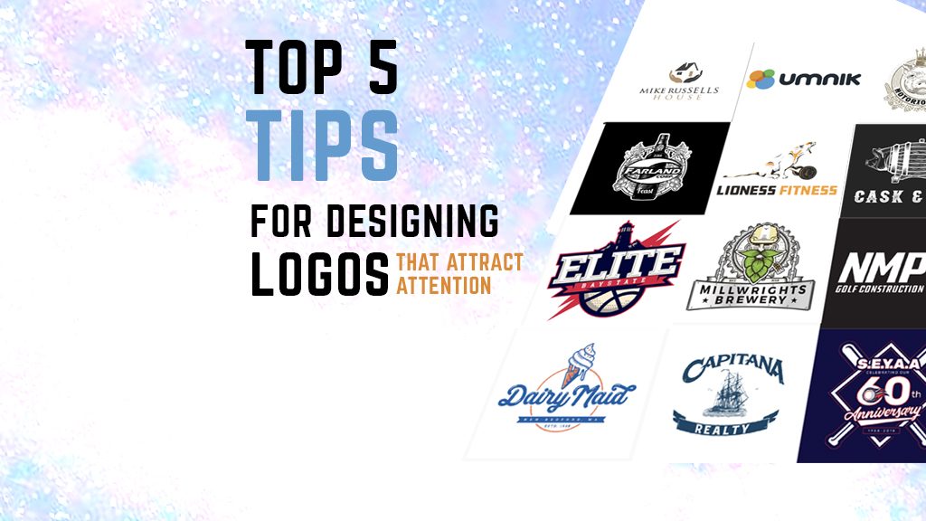
Top 5 Tips for Designing Logos That Attract Attention
So you’re designing a logo. It sounds simple enough, right? Type in the organization’s name, maybe place it in a circle and you’re done. Shockingly, there’s much more to it than that.
1. Color is Important
A standout amongst the most significant contemplations for logo design is the color palette. This is anything but a shallow choice, color conveys meanings and communicates to the viewer.
Now and again you’re limited to the colors and shades of a brand, however, sometimes you’ll have the opportunity to design freely. Take a look at the colors used in our logo design for Egan Tree Services.

2. Keep it simple
Let’s be honest, not everyone can break out a hand-drawn script spontaneously. Because you’re a designer doesn’t mean you’re a wonderful illustrator or typographer. If the person described is you, don’t worry, there’s nothing keeping you from making eye-catching logos.
In this circumstance, recall these three ground-breaking words: keep it simple! Simple yet amazing logos saturate the business world and prove to be the best symbols for standing the test of time.

3. Make it Unique
Rather than following the herd and using a cliché design, you should instead strive for something that is uniquely recognizable.
As you’re designing logos, think about whether your design is generic or unique. Is it likely that others will deliver something comparable? Keep in mind, your first thought is normally your most generic. Take a stab at filling a notebook page or two with some rough ideas before picking which design you should further elaborate on.

4. Think About Negative Space
When designing a logo try to utilize the negative space in a logo in some clever way.

5. Know What it Means
Sometimes we are stuck thinking that some logo designers don’t come up with a meaning for what they have just designed. It’s awesome when you as a designer can demonstrate to a client how much idea and thinking went into the logo that you designed for them.