Top 5 Design Tips When Building a Website
The layout of your homepage is like a sales pitch, so you have to feel like a client. It shouldn’t be about you, what you prefer, or if you believe it’s nice to have a particular component or impact. It is simple to get carried away on design components such as scrolling or parallaxing, but make sure you are prepared to consider the design of your audience. Incorporating your homepage with the recent developments in web design may be interesting, but you need to make sure it suits your prospective clients as well as your brand.
Building an incredible homepage is not difficult. Before you start, though, you need to think some stuff through. With that in mind, for your homepage design, here are a few essential do’s and don’ts to keep in mind.
1. Make it Simple Stupid. Has to be Easy to Navigate
It is very important to have a clean layout for your homepage. Having too much can be intimidating. You should am to keep your page with just the right amount of elements and content to deliver your message. Having the correct organized links to where your visitor has to go will show intelligence and professionalism.
Do: Keep homepage simple, clean and concise. Place useful information where it is easy to find, and also where a visitor would expect to see it.
Don’t: Overdo the visitor, don’t doing things dramatically different will be positive. Keep your website homepage clean and easy to navigate.
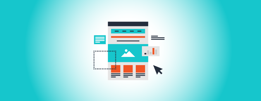
2. Use The Best High-Quality Images
It is very important to use high-quality imagery is very important to convey professionalism and visual appeal. They always say a picture is worth a thousand words. That is no different for your website. You need to stand out. Visitors expect to see visual imagery with text overlays and buttons. It shows that your website is in the modern era and may reflect on your business the same. What is important to remember is not to use huge images. They will make your site run slower and that can have an adverse effect.
Do: Use original photography when possible. If you do not have any original photography purchase images from a stock website.
Don’t: Use images from google or anything that has watermarks. Doing so can be considered stealing and in the case of using watermarked photography, you run the risk having stock websites contact you to take unpurchased content down.

3. Pick the Correct Color Scheme That Represents you.
Your website is kind of like a house, the colors need to match well to pull everything together.
The color combination you select should have a visceral reaction to your visitors. It should go along with your general branding. Make sure your color selection credits the reaction that fits with your brand.
Do: Use the Color Scheme throughout your entire website.
Don’t: Use a lot of different colors and or pallettes. Very easy to spot as unprofessional.

4. Update Your Website Consistently With Relevant Engaging Content
From returning visitors to search engine optimization, content is the life’s blood to grow your visitors and create engagement. Within your homepage do not overdo it, just enough to entice your visitors to click on a link to learn more. More of the heavier content load of information should be on other inner pages. Make sure the important information is front and center and does not get lost in the shuffle.
Do: Keep it fresh and new, let visitors know your website is up-to-date and has relevant content, and information.
Don’t: Too much text, don’t let your visitors feel overwhelmed with information overload. It is important to have content but too much just doesn’t keep your visitors engaged.
5. Homepage Optimizing Your Call To Actions (CTA)
Having a call to actions or CTAs on your homepage are very important if you are driving vistors/potential clients to product/services/information for page converts. These buttons are the doors to the important second steps in a website visitors cycle so make them cool and functional and get those clicks.
Do: Have clear and easy to locate CTS. Keep it less than five words if possible.
Don’t: Make it hard to find and confusing. It should not compete with other information elements. The main reason it is there is to get people to click them.