Cool packaging for cat food I found at New Bedford Pet Fest. There is always great design somewhere, especially at a festival for pets.
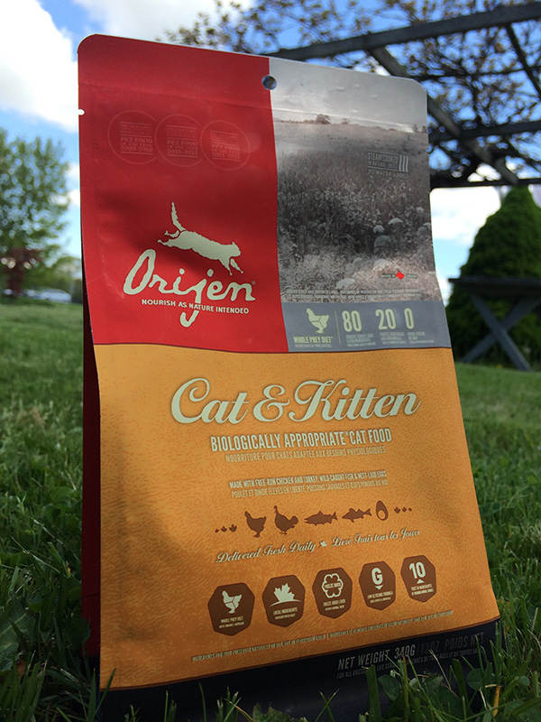
Today my family and I went to Pet Fest at Buttonwood Park Zoo, an annual event where pet enthusiast talk, mingle and visit booths that offer different pet products. We were helping our friends at Marvin Grain set up for the event. As we were setting up my wife and I noticed that all the different dog and cat food packages had really cool designs. It makes sense really, you should always have good design, never marginalize what usually is a customers first impression. This especially holds true with pet food. Think about it, most people aren’t actually eating the stuff. I say most people because, there is definitely one dude out there that is stuffing his face with kibble’s and bits. But I digress, the point I’m making is that when most people are picking a dog or cat food they will pick it solely based on the packaging design. If it looks cool it most be good. One design that stood out was from the company Orijen. Orijen had a real simple design, broken up into three parts. Using subtle textures and clean fonts, giving the piece a nice elegant natural feel. Hence the quality is healthy and of high quality. Also check out Blue Buffalo, they had a real cool design, a Native American feel.